In the rapidly evolving landscape of software development and user interface design, creating cohesive, scalable, and maintainable systems has become paramount. Design system architecture is revolutionizing how we build and manage digital products, offering a structured approach to crafting user interfaces that are both visually appealing and functionally robust. This comprehensive guide will delve into the intricacies of design system architecture, providing tech enthusiasts with the knowledge and insights needed to elevate their development practices.
Understanding the Core Principles of Design System Architecture
At its core, design system architecture is built on a simple yet powerful principle: any interface can be expressed through combinations of simple elements. This fundamental concept drives the entire structure and organization of a well-crafted design system. By breaking down complex interfaces into smaller, reusable components, developers and designers can create more consistent, efficient, and scalable products.
The Four Pillars of Design System Architecture
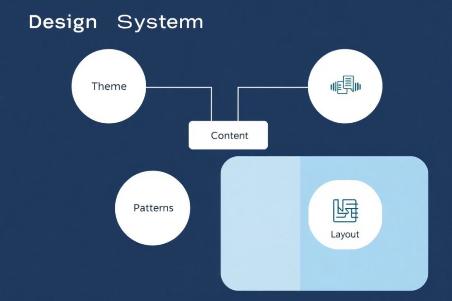
To truly grasp the essence of design system architecture, we need to explore its four key levels: Theme, Content, Patterns, and Layout. Each of these levels plays a crucial role in creating a cohesive and flexible design system.
The Theme Level: Setting the Visual Foundation
The theme level serves as the bedrock of your design system, influencing all other levels and defining the overall visual language of your interface. It encompasses the most basic elements and their associated values, which are typically manipulated through variables or design tokens.
Key Components of the Theme Level
The theme level includes various visual elements that form the foundation of your design system:
Typography is a crucial aspect of the theme level, defining the typefaces, font sizes, line heights, and other text-related properties used throughout the interface. A well-defined typography system ensures consistency and readability across all components.
Color palette is another essential component, establishing the primary, secondary, and accent colors that will be used throughout the interface. A thoughtful color scheme can convey brand identity, improve usability, and create visual hierarchy.
Shapes and geometries define the basic forms used in UI elements, such as buttons, cards, and input fields. Consistent use of shapes contributes to a cohesive visual language.
Shadow effects add depth and dimensionality to the interface, helping to create visual hierarchy and distinguish between different interface elements.
Border weights and radii define the thickness and curvature of element borders, contributing to the overall look and feel of the interface.
Layout dimensions and spacing establish the grid system and spacing rules that govern the arrangement of elements within the interface.
Animation properties define the timing, easing, and other characteristics of interface animations, ensuring a consistent and smooth user experience.
Overall layout settings determine the basic structure of the interface, including things like maximum content width and global margins.
By adjusting these parameters, developers and designers can dramatically transform the visual appearance of their product while maintaining consistency across different components and screens.
The Power of Variables and Design Tokens
One of the most significant advantages of a well-structured theme level is the use of variables, often referred to as design tokens. These tokens serve as a unified language bridging the gap between design and front-end development.
Instead of hard-coding specific values, design tokens allow developers to reference named variables. For example, rather than using a hex code like #FF005B throughout the codebase, a token named color-brand might be used. This approach offers several benefits:
- Simplified collaboration between designers and developers, as they can speak the same language and refer to the same tokens.
- Easy modifications, as changing a value in one place updates it system-wide.
- Reduced errors by minimizing the risk of outdated or incorrect manually entered values.
- Improved scalability, as core system variables can be easily extended to different platforms and technologies.
- Enhanced customization potential, allowing for the creation of entirely new visual languages by modifying a set of variables.
The Importance of Semantic Naming
As design systems grow in complexity, the number of variables can become overwhelming. This is where semantic naming comes into play. By grouping elements based on their roles and establishing a clear hierarchy, developers create a more intuitive and manageable system.
For instance, instead of naming colors based on their visual properties (e.g., "Blue-400"), semantic names that describe their function (e.g., "accent-color" or "action-color") are used. This approach helps team members understand the significance of each element at a glance and promotes consistency in usage across the system.
The Content Level: Building the Basic Elements
Moving beyond the theme, we encounter the content level. This is where developers define and style the fundamental building blocks of the interface:
Text elements form the basis of most interfaces, including headings, paragraphs, lists, and other typographic components.
Basic controls such as buttons, input fields, checkboxes, and radio buttons are essential interactive elements that users engage with directly.
Simple icons provide visual cues and enhance the usability of the interface.
Graphics like logos and flags contribute to branding and visual identity.
When combined with the theme level, these content elements take on their unique styling, creating the core visual components of the interface.
Hierarchical Typography
Following the semantic approach established in the theme level, the content level introduces a hierarchy of typography. This includes various heading levels, subheadings, body text, and more. Each of these text styles is defined with specific properties that align with the overall design language.
For example, a typical typographic hierarchy might include:
- H1: Main page headings
- H2: Section headings
- H3: Subsection headings
- Body: Regular paragraph text
- Caption: Smaller text for labels or annotations
Each of these styles would have predefined properties such as font size, weight, line height, and color, all derived from the theme level tokens.
Color Semantics in Action
The semantic grouping of colors established in the theme level comes to life in the content level. Here, developers see how primary, secondary, accent, and neutral colors are applied to various interface elements, creating a cohesive and meaningful color scheme.
For instance:
- Primary colors might be used for main action buttons and key interactive elements.
- Secondary colors could be applied to less prominent UI elements or for creating contrast.
- Accent colors might highlight important information or calls-to-action.
- Neutral colors often form the backdrop of the interface, used for backgrounds, borders, and non-interactive text.
The Pattern Level: Crafting Complex Components
As we move up the hierarchy, we reach the pattern level. This is where more complex information structures and interactive elements come into play. Patterns are responsible for visually representing and organizing information in ways that go beyond simple controls and content.
Common Pattern Examples
Some common patterns that developers frequently work with include:
Icon and text combinations, which pair visual symbols with descriptive text to enhance understanding and usability.
Cards, especially prevalent in mobile interfaces, group related information into digestible chunks.
Forms organize input fields, labels, and submission controls into coherent structures for data entry.
Tables present structured data in rows and columns, often with sorting and filtering capabilities.
Lists of elements display collections of similar items, such as product listings or user directories.
Navigation menus provide structure and allow users to move between different sections of an application.
What makes patterns particularly powerful is their ability to have modifiers. These modifiers allow for the creation of diverse yet consistent interfaces. For instance, a single "payment method" pattern could be modified to create a payment methods list, a saved card widget, or a settings menu item.
The Interplay Between Patterns and Theme
One of the strengths of this architectural approach is how changes at the theme level cascade through to affect patterns. A simple adjustment to color variables or typography in the theme can transform the appearance of complex patterns throughout the interface, ensuring consistency and making large-scale visual updates more manageable.
This interplay allows developers to create highly flexible and customizable interfaces without sacrificing consistency or requiring extensive code changes.
The Layout Level: Bringing It All Together
At the highest level of design system architecture, we have the layout. This is where patterns, themed content, and structural elements come together to form the final interface. The layout level can be broken down into several key components:
Sections
By default, a layout might span the entire width of the screen. However, it can be divided into multiple sections with varying proportions based on specific requirements. Within each section, developers define:
- The width of the content area
- Safe margins to ensure content doesn't crowd the edges of the screen
- Any specific layout rules or constraints that apply to that section
Grid Systems
A crucial part of many layouts is the grid system. Grids help define component widths and organize elements within the available space. Key parameters for grids include:
- Number of columns (typically 12 or 16 for responsive designs)
- Gutters (spacing between columns)
- Margins (spacing at the edges of the grid)
The specifics of the grid system are typically defined at the theme level, allowing for easy adjustments that propagate throughout the entire interface.
Breakpoints
In our multi-device world, breakpoints play a critical role in creating adaptive layouts. These are specific screen widths at which the interface's appearance and behavior change to ensure optimal display across various devices and screen resolutions.
Common breakpoint widths might include:
- 320px for small mobile devices
- 768px for tablets and larger mobile devices
- 1024px for small desktop screens
- 1440px for large desktop screens
Breakpoints are usually defined at the theme level but come into play most visibly in the layout, where they determine how elements reflow and resize based on the available screen real estate.
Scaling to a Product Ecosystem
While the architecture we've discussed can be applied to a single product, its real power shines when scaling to an entire ecosystem of products. Here are some strategies for managing this complexity:
Base and Product Libraries
For multi-product ecosystems, consider separating your design system into two main libraries:
- Base Library: Contains the content level with the simplest, most reusable elements.
- Product Library: Houses the patterns level with product-specific components.
This separation allows for the reuse of basic components across different products while maintaining the flexibility to create unique, product-specific patterns.
Theme Management
When dealing with multiple products, developers have two main approaches to theme management:
- Separate Themes: If products have distinct visual styles, create separate themes for each.
- Unified Theme: If products share a common visual language, use a single theme for consistency.
Unified Semantic Structure
Regardless of whether separate or unified themes are used, maintaining a consistent semantic structure for design tokens is crucial. This template approach, where token names remain consistent while values change, simplifies theme creation and allows for various customization options across the product ecosystem.
Practical Application: Implementing Design System Architecture
Now that we've covered the theoretical aspects, let's look at some practical ways to implement this architecture in the development workflow.
Tools and Technologies
Several tools can help manage and implement design system architecture:
Figma and Sketch are popular choices for creating and managing design assets and tokens. These tools offer powerful features for creating and organizing design components, as well as exporting design tokens for use in development.
Storybook is an open-source tool for developing and documenting UI components in isolation. It allows developers to build and test individual components separately from the main application, ensuring consistency and reusability.
Style Dictionary is a build system that allows you to define styles once, in a way for any platform or language to consume. It's particularly useful for transforming design tokens into platform-specific variables.
CSS-in-JS libraries like styled-components or Emotion allow for the creation of themeable components with dynamic styling. These libraries make it easier to implement design tokens and create flexible, reusable components.
Implementation Steps
Define your theme: Start by creating a comprehensive set of design tokens that cover all aspects of your visual language. This includes colors, typography, spacing, and other foundational elements.
Build your content library: Implement basic UI elements using your theme tokens. This includes buttons, form inputs, typography styles, and other fundamental components.
Develop patterns: Create more complex components by combining content elements and adhering to your theme. This might include navigation menus, card layouts, or form structures.
Establish layout guidelines: Define your grid system, breakpoints, and overall layout structure. This ensures consistency in how components are arranged across different screen sizes and devices.
Document everything: Create clear documentation for each level of your architecture, including usage guidelines and examples. This is crucial for team adoption and maintaining consistency over time.
Implement in code: Use your chosen technologies to bring your design system to life in your codebase. This might involve setting up a component library, implementing design tokens, and creating reusable layout components.
Continuously iterate: Regularly review and refine your design system based on real-world usage and feedback. As products evolve and new requirements emerge, your design system should adapt accordingly.
Conclusion: The Power of Thoughtful Architecture
A well-structured design system architecture is more than just a set of components – it's a powerful tool for creating cohesive, scalable, and maintainable digital products. By understanding and implementing the four levels of theme, content, patterns, and layout, developers can create a robust foundation that supports efficient development, consistent user experiences, and the flexibility to evolve products over time.
The key to success lies in the thoughtful organization of the system, clear communication between design and development teams, and a commitment to maintaining and evolving the architecture as products grow. With these principles in mind, tech enthusiasts will be well-equipped to tackle the challenges of modern interface design and development.
Embracing the power of design system architecture can transform the approach to building digital experiences. It provides a structured framework that enhances collaboration, reduces redundancy, and ensures consistency across products and platforms. As the digital landscape continues to evolve, having a solid design system architecture in place will become increasingly crucial for creating successful, user-centric products that can stand the test of time.