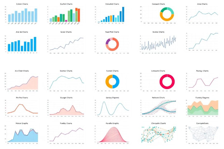
In our data-driven world, the ability to present information clearly and compellingly is a crucial skill. Whether you're a seasoned data scientist, a business analyst, or simply someone looking to communicate complex ideas effectively, understanding the nuances of data visualization is paramount. This comprehensive guide explores 16 fundamental chart types that form the backbone of data visualization, empowering you to choose the perfect visual representation for your data and tell compelling stories through graphics.
The Power of Visual Communication
Before we delve into specific chart types, it's essential to understand why data visualization is so powerful. Humans are visual creatures, with nearly 50% of our brain dedicated to visual processing. We can grasp visual information 60,000 times faster than text, making well-designed charts and graphs invaluable tools for quickly conveying complex information.
1. Column Charts: The Vertical Virtuosos
Column charts, with their vertical bars, are the workhorses of data visualization. They excel at showcasing numerical comparisons across categories, leveraging our innate ability to perceive differences in height.
Column charts are ideal for comparing discrete categories, typically working best with fewer than 10 categories. They're particularly effective at displaying both positive and negative values, making them perfect for financial data or survey results.
From a technical perspective, modern data visualization libraries like D3.js and Chart.js offer robust implementations of column charts. These libraries allow for interactive features such as tooltips, animations, and dynamic data updates. When implementing column charts, consider adding features like click-to-sort functionality or the ability to switch between stacked and grouped views for multi-series data.
2. Bar Charts: Horizontal Heroes
Bar charts are essentially rotated column charts, making them perfect for scenarios where category labels are lengthy or numerous. They provide ample space for detailed category labels and excel at ranking data.
In the tech world, bar charts are often used to display benchmark results, API response times, or resource utilization across different systems. When working with bar charts programmatically, consider implementing sorting functions to arrange bars by value, enhancing the chart's readability and impact.
For large datasets, consider implementing virtual scrolling or pagination to maintain performance while allowing users to explore extensive data sets efficiently.
3. Line Charts: Trend Trackers Extraordinaire
Line charts are the go-to choice for visualizing data trends over continuous intervals, making them indispensable for time-series analysis. They clearly show data progression over time and can display multiple series for easy comparison.
In the tech industry, line charts are ubiquitous in monitoring dashboards, showing everything from server response times to user engagement metrics over time. When creating interactive line charts, implement zoom and pan functionality to allow users to explore specific time ranges in detail. Consider adding features like data point highlighting on hover and the ability to toggle series visibility for multi-line charts.
For real-time data visualization, implement efficient data streaming and rendering techniques to ensure smooth updates without overwhelming the browser.
4. Area Charts: Cumulative Champions
Area charts build upon line charts by filling the space between the line and the axis, emphasizing the volume of data over time. They're particularly effective at highlighting cumulative values and proportions.
In tech applications, area charts are often used to visualize resource allocation over time, such as memory usage across different processes or storage utilization in cloud environments. When designing area charts, pay close attention to color opacity. Semi-transparent fills allow overlapping areas to remain visible, preserving data integrity in stacked area charts.
Consider implementing interactive features like click-and-drag selection for date ranges or the ability to switch between stacked and streamgraph views for multi-series data.
5. Pie Charts: Proportion Powerhouses
Pie charts are circular graphs divided into slices, each representing a proportion of the whole. While often overused, they can be effective for showing simple part-to-whole relationships when used judiciously.
In tech contexts, pie charts might be used to show market share among competing technologies or the breakdown of different types of network traffic. To enhance pie charts, consider implementing interactive features that allow users to "explode" slices for a closer look or dynamically resize based on user input.
Remember that pie charts work best with a small number of categories (ideally 5 or fewer) and when the differences between slices are significant. For more complex data, consider alternatives like treemaps or stacked bar charts.
6. Scatter Plots: Correlation Crusaders
Scatter plots use dots to represent the values of two different variables, helping to identify correlations or clusters within data. They're incredibly versatile and can display large datasets efficiently.
In data science and machine learning, scatter plots are essential for exploratory data analysis, helping to visualize relationships between features or the distribution of data points. When working with large datasets in scatter plots, implement data sampling techniques or canvas-based rendering to maintain performance.
Consider adding trendlines or regression curves to highlight relationships, and implement brushing and linking techniques for interactive exploration of multi-dimensional data.
7. Bubble Charts: Three-Dimensional Data Dynamos
Bubble charts extend scatter plots by introducing a third variable represented by the size of each data point. This allows for the visualization of three variables simultaneously, making them effective for comparing entities across multiple attributes.
In tech applications, bubble charts might be used to compare cloud service providers by cost, performance, and market share, or to analyze programming languages by popularity, job demand, and average salary.
When creating bubble charts, carefully consider the scale of your bubble sizes. Implement logarithmic scaling for datasets with extreme value ranges to ensure all bubbles remain visible. Add interactive features like hover tooltips to display precise values and the ability to filter or highlight specific data points.
8. Gauge Charts: Performance Meters
Gauge charts, reminiscent of speedometers, are excellent for displaying single values within a defined range. They instantly communicate a value's position within a range and often use color coding for quick interpretation.
In tech monitoring and dashboards, gauge charts are frequently used to display resource utilization, system health scores, or key performance indicators (KPIs). When implementing gauge charts, consider adding animation to the needle movement for a more engaging user experience. This can be particularly effective when values update in real-time.
Enhance gauge charts with features like dynamic thresholds that change color based on predefined ranges, or the ability to display historical min/max markers alongside the current value.
9. Radar Charts: Multi-dimensional Marvels
Also known as spider charts, radar charts plot multiple variables on axes starting from the same point, forming a polygon shape. They're effective for comparing multiple quantitative variables and showing performance across various dimensions.
In tech contexts, radar charts might be used to compare the features of different software packages, evaluate the performance of machine learning models across multiple metrics, or assess the skillset of IT professionals.
When creating radar charts, pay careful attention to axis scaling. Ensure all axes use the same scale to prevent misinterpretation, or clearly label different scales if they're necessary. Implement interactive features like the ability to highlight specific axes or data points, and consider adding animation to smoothly transition between different datasets.
10. Treemaps: Hierarchical Data Visualizers
Treemaps display hierarchical data using nested rectangles, where the size of each rectangle corresponds to the quantity it represents. They efficiently use space to display hierarchical structures and allow for exploration of data at various levels of detail.
In tech applications, treemaps are often used to visualize file and folder structures, analyze code repositories by size and complexity, or display the hierarchy of components in large software systems.
Implement zooming and drilling capabilities in treemaps to allow users to navigate through different levels of the hierarchy seamlessly. Consider adding features like hover tooltips to display detailed information and the ability to customize color schemes based on different attributes of the data.
11. Funnel Charts: Process Visualizers
Funnel charts illustrate a process that moves through stages, typically showing a decreasing value as it progresses. They clearly show progression through stages and highlight drop-offs between stages.
In the tech world, funnel charts are commonly used to analyze user flows through websites or apps, visualize conversion rates in e-commerce, or track the progress of support tickets through various stages.
Enhance funnel charts with hover effects that display detailed information about each stage, including absolute values and percentages. Consider adding interactive features that allow users to click on stages to drill down into more detailed data or compare multiple funnels side-by-side.
12. Heatmaps: Density Detectives
Heatmaps use color-coding to represent data values in a two-dimensional grid, making it easy to spot patterns and concentrations. They're effective for large datasets and quickly identify hotspots and trends.
In tech applications, heatmaps are used for various purposes, from visualizing website click patterns to displaying correlation matrices in machine learning models. When creating heatmaps, carefully choose your color scale. Consider using perceptually uniform color scales like viridis or magma for more accurate interpretation of data intensity.
Implement interactive features like zoom and pan for large heatmaps, and consider adding the ability to adjust color scales dynamically based on selected data ranges.
13. Sankey Diagrams: Flow Visualizers
Sankey diagrams illustrate the flow of data or resources between different stages or categories, with the width of each flow representing its quantity. They're effective for visualizing complex systems and highlighting major contributors and endpoints.
In tech scenarios, Sankey diagrams might be used to visualize data flow in complex ETL processes, show user journeys through a website, or illustrate energy consumption across different components of a data center.
Implement interactive features in Sankey diagrams that allow users to highlight specific flows or nodes, revealing detailed information about transfers and connections. Consider adding the ability to rearrange nodes or filter flows to focus on specific aspects of the system.
14. Parallel Coordinates: Multi-dimensional Data Explorers
Parallel coordinates plots use parallel axes to represent different dimensions, allowing for the comparison of multiple variables across many data points. They can display many dimensions simultaneously and reveal patterns and correlations across multiple variables.
In data science and machine learning, parallel coordinates are valuable for exploring high-dimensional datasets, comparing feature importance, or visualizing the results of dimensionality reduction techniques.
Implement brushing and linking in parallel coordinates plots to allow users to select and highlight specific data ranges, enhancing the exploration of complex datasets. Consider adding features like axis reordering to help identify correlations and the ability to apply different scaling methods to each axis.
15. Network Graphs: Relationship Mappers
Network graphs, also known as node-link diagrams, display interconnected entities as nodes with lines (edges) representing relationships between them. They're ideal for illustrating complex relationships and connections.
In tech contexts, network graphs are used to visualize social network connections, map out computer network topologies, or display dependencies in software architectures.
When working with large network graphs, implement force-directed layouts and on-demand rendering to manage computational complexity and maintain interactivity. Consider adding features like community detection algorithms to highlight clusters within the network and the ability to filter or highlight specific types of nodes or connections.
16. Choropleth Maps: Geographical Data Painters
Choropleth maps use color gradients to represent data values across geographic regions, providing an intuitive way to visualize spatial patterns. They effectively show data distribution across geographic areas and support interactive exploration of regional data.
In tech applications, choropleth maps might be used to display the distribution of internet connectivity speeds across a country, visualize the adoption rates of different technologies by region, or show the geographical distribution of data breaches.
When creating choropleth maps, ensure you normalize data by population or area when appropriate to avoid misrepresentation due to varying region sizes. Implement interactive features like zoom and pan, hover tooltips for detailed information, and the ability to switch between different data layers or time periods.
Conclusion: The Art and Science of Data Visualization
Mastering these 16 chart types provides you with a powerful toolkit for data visualization, enabling you to transform raw data into compelling visual narratives. As you apply these techniques, remember that effective visualization is both an art and a science. It requires not only technical skill but also a deep understanding of your data, your audience, and the story you want to tell.
In the rapidly evolving tech landscape, the ability to create clear, insightful, and engaging data visualizations is more valuable than ever. Whether you're presenting to stakeholders, analyzing trends, or exploring complex datasets, these visualization techniques will help you communicate your findings with impact and precision.
As you continue to develop your data visualization skills, stay curious and experimental. Explore new chart types, combine different visualization techniques, and always strive for clarity and insight in your visual representations. With practice and creativity, you'll be able to unlock the full potential of your data, revealing patterns and insights that can drive informed decision-making and innovation in the tech world and beyond.