In the realm of web design, every element plays a crucial role in creating a cohesive and visually appealing user experience. Among these elements, the humble horizontal rule, represented by the <hr> tag, often goes unnoticed. However, with the power of CSS, this simple divider can be transformed into a design powerhouse. In this comprehensive guide, we'll delve deep into the art of styling horizontal rules, exploring techniques that range from basic to advanced, and uncovering how this often-overlooked element can elevate your web design to new heights.
The Evolution of the Horizontal Rule
The horizontal rule has come a long way since the early days of HTML. Originally, it was a mere line used to separate content sections. Today, thanks to the advancements in CSS, it has evolved into a versatile design element that can convey meaning, enhance visual hierarchy, and add aesthetic value to web pages.
Understanding the Basics of HR Styling
Before we dive into more complex styling techniques, it's essential to grasp the fundamental CSS properties that govern the appearance of horizontal rules. The most commonly used properties include:
border: This property is crucial for defining the line's appearance.background: Used to set the background color or even images for the hr element.height: Determines the thickness of the rule.width: Controls the length of the horizontal rule.margin: Adds space around the rule, helping with layout and spacing.
Let's start with a basic example to illustrate these properties in action:
hr {
  border: none;
  height: 2px;
  background-color: #333;
  margin: 20px 0;
}
This simple code creates a clean, solid black line with some vertical margin, demonstrating how even basic styling can significantly improve the default appearance of the <hr> tag.
Advanced Styling Techniques for Horizontal Rules
As we move beyond the basics, we enter a world of creative possibilities. Let's explore some advanced techniques that can transform your horizontal rules into striking design elements.
Gradient Horizontal Rules
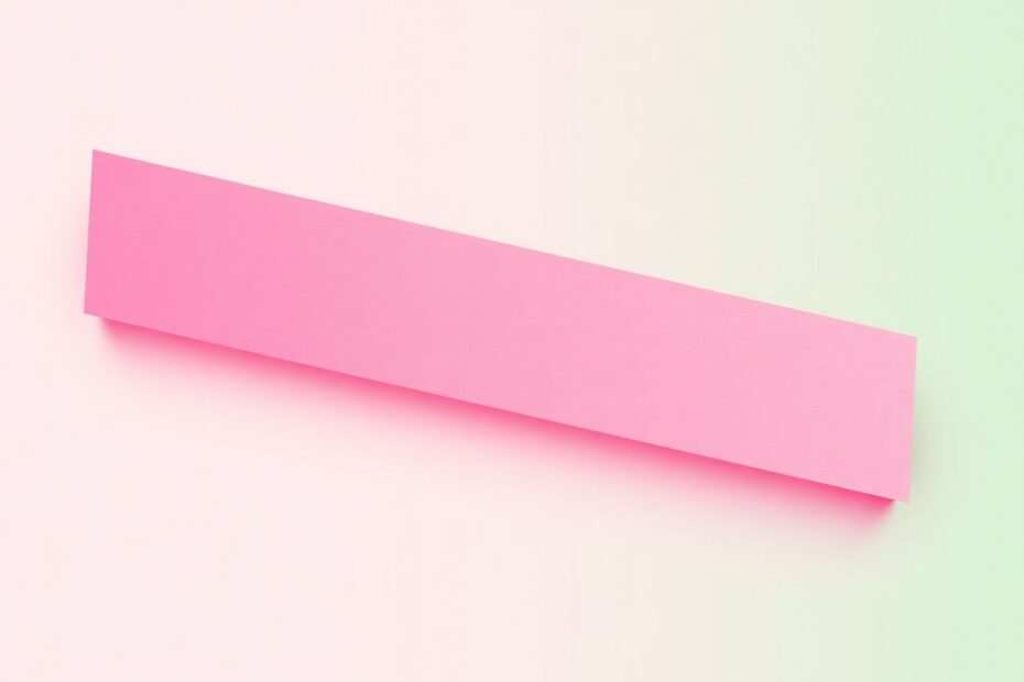
Gradients can add depth and visual interest to your horizontal rules. By utilizing CSS gradients, you can create eye-catching dividers that seamlessly blend with your design:
hr {
  border: none;
  height: 3px;
  background: linear-gradient(to right, #ff0066, #99ff66);
}
This code creates a vibrant gradient that transitions from pink to green, adding a modern touch to your page dividers.
Textured Horizontal Rules
Textures can add a tactile quality to your design, even in digital form. By using background images or repeating patterns, you can create horizontal rules that appear to have depth and texture:
hr {
  border: none;
  height: 10px;
  background: url('path/to/texture.png') repeat-x;
}
This technique allows you to use any image as a repeating pattern, opening up endless possibilities for creative horizontal rules.
Animated Horizontal Rules
Animation can bring life to static elements, drawing attention and adding a dynamic feel to your web pages. Here's an example of how to create an animated horizontal rule that grows from left to right:
@keyframes grow {
  from { width: 0; }
  to { width: 100%; }
}

hr {
  border: none;
  height: 2px;
  background-color: #333;
  animation: grow 2s ease-out;
}
This animation creates a sense of progression and can be particularly effective when used to separate sections of a long-form article or as part of a loading indicator.
Creative Designs for Horizontal Rules
The true potential of horizontal rules is realized when designers think outside the box. Let's explore some creative designs that push the boundaries of what's possible with the <hr> tag.
The Ribbon Effect
Transform your horizontal rule into a ribbon-like design for a decorative touch:
hr {
  border: none;
  height: 20px;
  position: relative;
  background: #333;
}

hr:before {
  content: "";
  height: 20px;
  position: absolute;
  top: -10px;
  left: 0;
  right: 0;
  background: linear-gradient(45deg, transparent 33.33%, #333 33.33%, #333 66.66%, transparent 66.66%),
              linear-gradient(-45deg, transparent 33.33%, #333 33.33%, #333 66.66%, transparent 66.66%);
  background-size: 20px 40px;
}
This code creates a ribbon-like effect that can add a sophisticated flair to your design, perfect for highlighting important sections or as a decorative element in headers or footers.
The Zigzag Line
For a more playful approach, consider a zigzag pattern:
hr {
  border: none;
  height: 30px;
  background: linear-gradient(135deg, #fff 25%, transparent 25%) -10px 0,
              linear-gradient(225deg, #fff 25%, transparent 25%) -10px 0,
              linear-gradient(315deg, #fff 25%, transparent 25%),
              linear-gradient(45deg, #fff 25%, transparent 25%);
  background-size: 20px 20px;
  background-color: #333;
}
This creates a visually interesting zigzag pattern that can add energy and movement to your page layout.
Responsive Design Considerations for Horizontal Rules
In today's multi-device world, responsive design is not just a luxury—it's a necessity. When styling horizontal rules, it's crucial to ensure they look good on all screen sizes. Here's an example of how to create responsive horizontal rules:
hr {
  width: 100%;
  max-width: 600px;
  margin: 20px auto;
  border: none;
  height: 2px;
  background-color: #333;
}

@media (max-width: 768px) {
  hr {
    max-width: 90%;
    height: 1px;
  }
}
This code ensures that the horizontal rule adjusts its width and thickness on smaller screens, maintaining its visual impact across devices.
Accessibility and Performance Considerations
While styling horizontal rules can greatly enhance the visual appeal of your website, it's important to consider accessibility and performance implications:
- Ensure sufficient color contrast between the hr element and the background to maintain readability for all users.
- If using complex designs or animations, consider the impact on page load times and optimize accordingly.
- For purely decorative horizontal rules, use
<div>elements styled as lines instead of<hr>tags to avoid confusion for screen readers. - When using animated or complex horizontal rules, test across different browsers and devices to ensure consistent appearance and performance.
Integrating Horizontal Rules into Your Design System
To maintain consistency across your website, consider creating a set of predefined styles for horizontal rules as part of your design system:
/* Primary divider */
hr.primary {
  border: none;
  height: 2px;
  background-color: #007bff;
}

/* Secondary divider */
hr.secondary {
  border: none;
  height: 1px;
  background-color: #6c757d;
}

/* Decorative divider */
hr.decorative {
  border: none;
  height: 10px;
  background: repeating-linear-gradient(45deg, #ff0066, #ff0066 10px, #99ff66 10px, #99ff66 20px);
}
This approach allows for consistent use of horizontal rules throughout your site while providing variety for different contexts and purposes.
Best Practices for Horizontal Rule Styling
To make the most of your horizontal rule styling efforts, keep these best practices in mind:
- Maintain consistency in your hr styles across your website to create a cohesive design language.
- Use different styles to indicate different types of content breaks or section divisions.
- Remember that horizontal rules are typically meant to be subtle dividers, not focal points. Use bold designs sparingly and purposefully.
- Test your styles across different browsers and devices to ensure compatibility and consistent appearance.
- Consider the overall design of your website and how the horizontal rules complement or enhance it.
Conclusion: Elevating Your Web Design with Styled Horizontal Rules
Styling horizontal rules in CSS offers a unique opportunity to enhance your web design subtly yet effectively. From simple solid lines to complex patterns and animations, the <hr> tag can be transformed into a versatile design element that complements your overall aesthetic and improves user experience.
By mastering the techniques outlined in this guide and keeping best practices in mind, you can turn these simple HTML elements into powerful tools for improving your site's visual appeal and structure. Whether you're creating a minimalist layout or a vibrant, creative website, the humble horizontal rule can play a crucial role in tying your design together and guiding users through your content.
As you continue to explore and experiment with hr styling, remember that the key to success lies in finding the right balance between form and function. Your horizontal rules should enhance readability and visual hierarchy without overshadowing your content. With thoughtful application of CSS styling techniques, you can elevate this often-overlooked element into a standout feature of your web design toolkit.