As a data scientist and R enthusiast, I'm excited to guide you through the treasure trove of pre-installed datasets in R. These datasets are invaluable tools for understanding complex statistical concepts and honing your analytical skills. Let's explore how these 12 essential datasets can elevate your data science journey and provide practical insights for real-world applications.
The Power of Pre-Installed Datasets
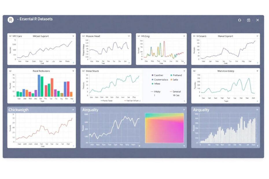
R's pre-installed datasets offer immediate accessibility, reliability, versatility, and reproducibility. They're curated by experts, cover a wide range of statistical concepts, and are universally available, making them perfect for learning and sharing analyses.
1. mtcars: Driving Your Regression Skills Forward
The mtcars dataset, a classic in the R world, contains information about various car models from the 1970s. With 32 observations of 11 variables, it's an excellent resource for practicing linear regression.
For instance, you can predict miles per gallon (mpg) based on horsepower (hp) and weight (wt):
model <- lm(mpg ~ hp + wt, data = mtcars)
summary(model)
This simple model reveals fascinating insights about the relationship between a car's weight, horsepower, and fuel efficiency. You might discover that for every 1000-pound increase in weight, the mpg decreases by about 3.9, holding horsepower constant.
2. iris: Blossoming into Classification
The iris dataset, featuring 150 observations of iris flowers across three species, is ideal for classification problems. It's particularly useful for understanding how different measurements contribute to species identification.
Try creating a decision tree:
library(rpart)
tree_model <- rpart(Species ~ ., data = iris)
plot(tree_model)
text(tree_model)
This visualization might show that petal length is the most crucial factor in distinguishing between iris species, with a threshold around 2.45 cm separating setosa from the other species.
3. ChickWeight: Growing Your Time Series Analysis Skills
The ChickWeight dataset, with 578 observations tracking chick weights over time under different diets, is perfect for longitudinal data analysis. It allows you to explore growth curves and diet effects.
Visualize the data with ggplot2:
library(ggplot2)
ggplot(ChickWeight, aes(Time, weight, color = Diet, group = Chick)) +
  geom_line() +
  facet_wrap(~Diet) +
  labs(title = "Chick Growth by Diet")
This visualization might reveal that chicks on Diet 3 show the most rapid weight gain, while those on Diet 1 have the slowest growth rate.
4. airquality: Breathing Life into Environmental Data Analysis
The airquality dataset offers 153 observations of daily air quality measurements in New York from May to September 1973. It's excellent for exploring relationships between environmental factors.
Examine correlations between variables:
cor(airquality[, c("Ozone", "Solar.R", "Wind", "Temp")], use = "complete.obs")
You might find a strong positive correlation between temperature and ozone levels, suggesting that ozone pollution tends to be worse on hotter days.
5. Boston: Building Your Multiple Regression Expertise
The Boston dataset from the MASS package contains 506 observations of housing values in Boston suburbs. It's ideal for multiple regression analysis and understanding factors affecting housing prices.
Try a multiple regression model:
library(MASS)
model <- lm(medv ~ crim + rm + tax, data = Boston)
summary(model)
This model might reveal that the number of rooms has a strong positive effect on housing prices, while crime rate has a negative impact.
6. faithful: Erupting with Statistical Insights
The faithful dataset, with 272 observations of Old Faithful geyser eruptions, is perfect for exploring bimodal distributions and time series analysis.
Visualize the waiting time distribution:
ggplot(faithful, aes(x = waiting)) +
  geom_histogram(binwidth = 5, fill = "skyblue", color = "black") +
  labs(title = "Distribution of Waiting Times", x = "Waiting Time (minutes)")
This histogram typically reveals a fascinating bimodal distribution, suggesting two distinct eruption cycles for the geyser.
7. CO2: Growing Your Understanding of Environmental Data
The CO2 dataset focuses on carbon dioxide uptake in grass plants, with 84 observations under various conditions. It's excellent for analyzing the effects of different treatments on plant physiology.
Compare CO2 uptake across plant types and treatments:
boxplot(uptake ~ Type * Treatment, data = CO2,
        main = "CO2 Uptake by Plant Type and Treatment")
This visualization might show that Quebec plants have higher CO2 uptake rates than Mississippi plants, especially when not chilled.
The Titanic dataset, available through the titanic package, is perfect for exploring survival analysis with its 2201 observations from the Titanic disaster.
Analyze survival rates by gender:
library(titanic)
titanic_data <- titanic_train[, c("Survived", "Pclass", "Sex", "Age")]
table(titanic_data$Survived, titanic_data$Sex)
chisq.test(titanic_data$Survived, titanic_data$Sex)
This analysis typically reveals a significant difference in survival rates between men and women, with women having a much higher chance of survival.
9. PlantGrowth: Cultivating Your ANOVA Skills
The PlantGrowth dataset, with 30 observations of plant weights under different treatments, is ideal for practicing analysis of variance (ANOVA).
Perform a one-way ANOVA:
anova_model <- aov(weight ~ group, data = PlantGrowth)
summary(anova_model)
This analysis might show significant differences in plant growth between treatment groups, providing insights into effective growth strategies.
10. Orange: Peeling Back the Layers of Growth Curves
The Orange dataset, containing 35 observations of orange tree growth, is perfect for exploring growth curves and mixed-effects models.
Visualize individual tree growth:
ggplot(Orange, aes(age, circumference, color = Tree)) +
  geom_line() +
  geom_point() +
  labs(title = "Orange Tree Growth")
This plot typically reveals varying growth rates among individual trees, with some showing more rapid growth than others.
11. swiss: Unraveling Socio-Economic Patterns
The swiss dataset offers 47 observations of socio-economic indicators in Swiss provinces, ideal for exploring correlations between various factors.
Create a correlation heatmap:
cor_matrix <- cor(swiss)
heatmap(cor_matrix, main = "Correlation Heatmap of Swiss Data")
This heatmap might reveal strong negative correlations between fertility rates and education levels, providing insights into demographic trends.
12. women: Weighing In on Simple Linear Relationships
The women dataset, while small with just 15 observations, is excellent for demonstrating simple linear regression between height and weight.
Visualize the relationship:
model <- lm(weight ~ height, data = women)
plot(women$height, women$weight, main = "Height vs Weight")
abline(model, col = "red")
This plot typically shows a strong positive linear relationship between height and weight, illustrating basic regression principles.
Conclusion: Embarking on Your Data Science Journey
These 12 pre-installed R datasets are more than just numbers – they're gateways to mastering statistical analysis and data science. From regression to classification, time series to ANOVA, each dataset offers unique opportunities to apply and understand crucial statistical concepts in real-world contexts.
As you explore these datasets, remember that the true power lies in how you apply them. Experiment with different visualization techniques, try various statistical models, and don't be afraid to combine datasets for more complex analyses. The skills you develop working with these datasets will form a solid foundation for tackling more challenging data problems in your future projects.
Whether you're a beginner just starting your journey in data science or an experienced analyst looking to refine your skills, these datasets provide a wealth of opportunities for learning and discovery. So, fire up your R console, start exploring, and let your curiosity guide you through the fascinating world of data analysis. Happy coding, and may your insights be as rich as the datasets you're working with!