If you publish content regularly, the social preview image is not a decorative extra. It is part of the delivery system. Every time a page is shared, the preview card becomes the first thing people see, and in many cases it decides whether the link gets a second look.
That is why Open Graph images deserve more attention than they usually get. They sit between your content and the platforms that distribute it. If they are missing, inconsistent, or hard to update, your publishing workflow slows down. If they are structured and automatable, the whole process becomes cleaner.
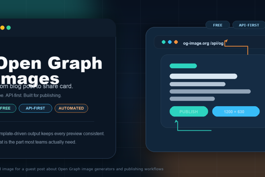
og-image.org is built for exactly that kind of workflow. The product is free, API-first, and designed for client-side generation, which makes it useful for teams that want repeatable social cards instead of one-off design tasks.
Why Open Graph images are a workflow problem, not just a design problem
Most people think about social preview images as a visual asset. That is only partly true. In practice, they are a metadata asset. They need to match the page title, the summary, the brand, and the platform dimensions without creating extra work for the editor or developer who is trying to get the page out the door.
That is why the problem gets worse as a site grows. One post is easy to handle manually. Ten posts a month is still manageable. But once a site publishes daily or runs multiple content streams, the preview card becomes a bottleneck. Someone has to decide the layout, export the image, upload the file, and make sure the right version is attached to the page.
The fastest teams stop treating that as a separate design request. They turn it into a repeatable publishing step.
What makes og-image.org useful
The main strength of og-image.org is not that it can create a pretty card. It is that it turns social image creation into a structured process. The official docs describe it as a no-auth API surface for image rendering and catalog discovery, and the API is designed for static sites, edge functions, and backend automation workflows.
That means you can move from “make me a social image” to “generate the social image from this page data” without adding a human design step in the middle. For content teams, that difference matters.
The documented endpoints cover the common tasks you need in production:
GET /api/ogfor rendering preview imagesGET /api/templatesfor browsing template defaultsGET /api/backgroundsfor curated background discoveryGET/POST/PATCH/DELETE /api/my-templatesfor saved templatesGET/POST/DELETE /api/favoritesfor saved background preferences
In other words, the tool is not just an editor. It is a system you can plug into your publishing stack.
Why the 1200×630 standard still matters
One reason social cards get messy is that every platform has its own preview behavior. Some trim more aggressively. Some compress harder. Some cache more aggressively. That creates a lot of room for ugly surprises if the image was never designed around a stable baseline.
The official og-image.org size guide recommends 1200×630 as the default OG image size. That is useful because it gives you one practical canvas that works across the major social surfaces without forcing you to maintain a different asset for every platform.
The rule is simple: keep the layout readable at preview size, leave safe space around the edges, and do not force tiny text into the corners. The image should still look clear when it is shrunk, cropped, or compressed.
If you want a deeper explanation of why that size works, the official guide on OG image sizing is the right place to start.
Where this fits in a WordPress publishing stack
For WordPress sites, the biggest advantage is that OG images can be treated like the rest of the page metadata. You already manage titles, excerpts, canonical URLs, and social descriptions. The preview image should belong in that same system.
That is especially true for sites that publish often. If you are using WordPress as a content engine, the best workflow is not to hand-build a share image after the article is finished. The better workflow is to generate the preview card from the same page fields that already power the post title and excerpt.
This is where automation becomes valuable. A simple template can render the post title, a short subtitle, and a brand mark in the right size every time. You do not have to reinvent the layout for each post. You just feed in the content variables and publish.
That approach pairs well with other WordPress best practices. If you care about the structure of your content, you probably also care about how titles, images, and metadata work together. Articles like The Ultimate Guide to Image SEO: Boosting Your Visual Content’s Visibility in 2025 and Beyond and Maximizing Your Digital Presence: The Ultimate Guide to Social Media Integration in 2025 cover the broader distribution side of that same idea.
Consistency is the part that gets overlooked. One social card may look fine even if it was assembled by hand. The real test is whether every card still looks like it came from the same brand system when you look at the whole archive.
That is where template-driven OG images outperform ad hoc design. A template keeps the brand color, typography, spacing, and headline placement stable. It also reduces the chance that one editor ships a card that looks completely different from the rest of the site.
Consistency has another advantage: it makes the page feel more trustworthy when people share it. Social previews are often the first branded surface that people see outside your site. If the card looks sloppy or inconsistent, the link feels less polished before the user even clicks.
That is why the best share cards are not flashy. They are clear. They are predictable. They are easy to recognize in a crowded feed.
How a practical OG image workflow looks
If you publish often, the workflow should be simple enough to repeat without thinking. A good setup usually looks like this:
- Write the page title and summary.
- Select a template that matches the brand system.
- Pass the content fields into the OG image generator.
- Export a 1200×630 PNG or JPG.
- Set the image in the page metadata.
- Validate the social preview before publishing.
That is the kind of process that keeps content teams moving. It removes the question of “who is making the social image?” and replaces it with “what data should the template render?”
The result is faster publishing and fewer handoff errors. The article gets published with a usable preview image on the first pass, instead of waiting for a second round of design cleanup.
What to avoid when you set this up
Most preview problems are boring technical mistakes, not platform bugs. If you want fewer surprises, avoid a few common errors:
- Do not use a relative image URL.
- Do not hide the image behind auth, geo rules, or hotlink protection.
- Do not place important text too close to the edge.
- Do not assume a huge file will preview better.
- Do not overwrite the same image URL and expect every platform cache to refresh instantly.
The official guides for Facebook, Twitter/X, and LinkedIn all point in the same direction: use explicit dimensions, keep the layout readable, and design for how previews are actually rendered. If you want the practical side of that advice, og-image.org also has platform-specific guides and a validator.
For example, the Facebook OG image guide, Twitter/X card guide, and LinkedIn preview guide are useful references when you are checking real-world behavior.
Why this matters for content teams, not just developers
It is easy to think of Open Graph automation as a developer-only concern. It is not. Content teams feel the pain first, because they are the ones who have to wait for the image to be finished before a post can go live.
A template-based generator lowers that friction. It gives writers and editors a predictable way to get a usable preview without asking the design team for a custom graphic every time. That is especially useful for blogs, news sections, product updates, and newsletters where speed matters.
It also helps SEO indirectly because it keeps the page metadata complete and organized. On a site that cares about structured content, the preview image should be as intentional as the title tag. If you already think carefully about headlines, descriptions, and internal links, the social card should be part of the same system.
That is also why articles like Maximizing Your Digital Presence: The Ultimate Guide to Social Media Integration in 2025 and The Ultimate Guide to SEO Title Tags: Boost Your Search Rankings in 2025 are good companions to this topic. They all point to the same idea: distribution works better when the page is structured from the start.
A better default for publishers
If you only publish occasionally, you can get away with manual social cards. But if you are running a real content operation, the better default is to automate the preview layer.
og-image.org is a strong fit for that because it is free, API-first, and built around the exact kind of repeatable workflow that publishers need. It gives you a stable 1200×630 baseline, a practical rendering API, and enough structure to make preview image creation feel like part of publishing instead of an extra task at the end of it.
That is the real point. Open Graph images are not just a visual add-on. They are a publishing primitive. Once you treat them that way, the workflow becomes cleaner, the brand stays more consistent, and every shared link looks more intentional.
For teams that publish at scale, that is the difference between a manual chore and a system.