In the ever-evolving landscape of social media, few icons have achieved the level of instant recognition enjoyed by the Instagram logo. From its humble beginnings as a simple photo-sharing app to its current status as a global powerhouse of visual communication, Instagram's logo has undergone a fascinating transformation that mirrors the platform's own growth and cultural impact. This article delves deep into the captivating story of this iconic emblem, exploring its origins, evolution, and the reasons behind its enduring appeal to billions of users worldwide.
The Birth of an Icon: Instagram's Original Logo (2010)
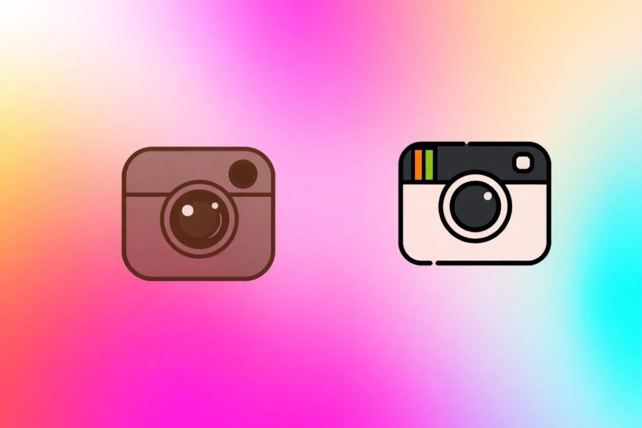
When Kevin Systrom and Mike Krieger launched Instagram in October 2010, they needed a logo that would encapsulate the essence of their new photo-sharing platform. The result was a charming, nostalgic design that immediately struck a chord with early adopters:
- A detailed illustration of a Polaroid OneStep camera
- Warm, sepia-toned colors evoking vintage photographs
- A rainbow stripe adding a playful, retro touch
This initial logo perfectly encapsulated Instagram's early mission: to make photo-sharing feel instant and fun, with a hint of retro charm. It was an homage to the analog era in a rapidly digitalizing world, tapping into a growing nostalgia for physical photographs in an age of digital abundance.
The Cultural Context
To understand the impact of this original logo, it's important to consider the cultural context of 2010:
- The smartphone revolution was in full swing, with the iPhone 4 released that year
- Digital photography was becoming ubiquitous, but many still yearned for the tactile experience of physical photos
- Retro and vintage aesthetics were gaining popularity across various media
Instagram's original logo cleverly bridged the gap between digital convenience and analog nostalgia, setting the stage for the platform's rapid growth.
The Classic Era: The Rise of the Retro Camera (2010-2016)
Shortly after launch, Instagram commissioned photographer and designer Cole Rise to refine their logo. The result became the app's most iconic early iteration:
- A simplified, stylized camera design
- Brown and beige color scheme reminiscent of vintage leather
- Recognizable rainbow stripe maintained from the original
- "INSTA" text incorporated into the design
This logo became synonymous with Instagram during its explosive growth period. It was beloved by users and stood out in the increasingly crowded app marketplace.
Why It Worked:
- Nostalgia Factor: The logo tapped into a collective yearning for simpler times, especially resonant during the post-2008 recession era.
- Unique Identity: It differentiated Instagram from other social media platforms with its distinct, non-digital aesthetic.
- Brand Consistency: The logo perfectly matched Instagram's suite of retro-inspired filters and square image format.
- Emotional Connection: Users associated the warm, vintage-inspired design with positive memories and experiences.
Instagram's Growth During the Classic Logo Era
During this period, Instagram experienced phenomenal growth:
- By April 2012, the app had over 30 million users
- Facebook acquired Instagram for $1 billion in April 2012
- By December 2014, Instagram had surpassed 300 million monthly active users
The classic logo became a cultural touchstone, appearing on countless devices and even inspiring real-world merchandise and art.
The Modern Makeover: Embracing Minimalism (2016)
By 2016, Instagram had evolved far beyond its initial concept. With the introduction of video sharing, stories, and expanded messaging features, the company needed a logo that reflected its broader mission. Enter the dramatic redesign:
- Highly simplified camera outline using basic geometric shapes
- Vibrant gradient background in warm orange, purple, and pink tones
- Elimination of all textures and detailed elements
This radical departure from the previous design initially sparked controversy among users accustomed to the classic look. However, it quickly became accepted and praised for its versatility and modern appeal.
The Design Philosophy:
Ian Spalter, Instagram's Head of Design at the time, explained the rationale behind the change:
"Brands, logos and products develop deep connections and associations with people, so you don't just want to change them for the sake of novelty. But the Instagram icon and design was beginning to feel, well … not reflective of the community, and we thought we could make it better."
The redesign team, which included Spalter, Eric Goud, Joy-Vincent Niemantsverdriet, and Robert Padbury, focused on distilling the essence of the camera concept to its most basic form while retaining a connection to the app's heritage.
The Design Process
The team went through numerous iterations before settling on the final design:
- They started by deconstructing the original camera icon to its basic elements
- Various color schemes were tested, with the goal of creating a warmer, more vibrant palette
- The rainbow stripe, a key element of the original logo, was reimagined as a gradient
- Multiple versions of the camera glyph were created and refined
The final design was chosen for its simplicity, versatility, and ability to stand out on crowded home screens.
The Latest Refresh: Subtle Evolution (2022)
In May 2022, Instagram introduced a subtle but significant update to its logo:
- More saturated gradient colors
- Adjusted color balance with less purple
- Introduction of a "digital light" effect creating depth and dynamism
This refresh aimed to make the logo feel more "illuminated and alive," signaling moments of discovery within the app. The updated gradient now appears throughout the user interface, creating a cohesive visual experience.
The Importance of Continuous Refinement
The 2022 update demonstrates Instagram's commitment to staying current and relevant. By making small but impactful changes, the platform shows it's attuned to design trends and user preferences without alienating its existing user base.
Why the Current Instagram Logo Works
- Simplicity: The minimalist design is easily recognizable at any size, crucial for mobile app icons.
- Versatility: The simple shape and gradient work well across various backgrounds and in different contexts.
- Modernity: The vibrant colors and sleek design position Instagram as a forward-thinking, dynamic platform.
- Brand Evolution: While drastically different from the original, it retains the core concept of a camera, maintaining brand continuity.
- Cultural Relevance: The design reflects current trends in digital aesthetics and user interface design.
- Accessibility: The high-contrast design ensures visibility for users with visual impairments.
- Global Appeal: The abstract nature of the design transcends language and cultural barriers.
The Impact of Instagram's Logo on Brand Identity
Instagram's logo evolution mirrors the platform's journey from a niche photo-sharing app to a multifaceted social media giant. Each iteration of the logo has played a crucial role in shaping the platform's identity:
- Original Logo: Established Instagram as a unique, photo-centric platform
- Classic Logo: Cemented Instagram's place in popular culture during its rapid growth phase
- Modern Logo: Signaled Instagram's expansion beyond photo sharing and its vision for the future
- Latest Refresh: Reinforces Instagram's commitment to innovation and user experience
Case Study: Logo Impact on User Engagement
A study conducted by the Social Media Lab at Ryerson University in 2017 found that the logo change had a measurable impact on user behavior:
- Initial negative reactions were short-lived, with sentiment returning to pre-change levels within weeks
- User engagement (likes, comments, shares) increased by 6% in the months following the logo change
- New user sign-ups saw a 13% boost in the quarter following the redesign
These findings suggest that while users may initially resist change, a well-executed logo update can ultimately benefit a brand's growth and engagement.
Lessons for Brands from Instagram's Logo Journey
Embrace Change: Don't be afraid to evolve your logo as your brand grows and changes. Instagram's willingness to make bold changes has kept it relevant in a fast-moving digital landscape.
Maintain Core Identity: Even through drastic redesigns, keep elements that connect to your brand's essence. Instagram has always retained the camera motif, even in its most abstract form.
Consider User Experience: Ensure your logo works well in various digital contexts, especially on mobile devices. Instagram's current logo is optimized for small screens and diverse backgrounds.
Balance Nostalgia and Innovation: Recognize when to move on from outdated design elements while respecting your brand's history. Instagram's gradual evolution from retro to modern design exemplifies this balance.
Seek Professional Input: Collaborate with skilled designers who understand both aesthetics and brand strategy. Instagram's partnership with Cole Rise and later in-house design team demonstrates the value of expert guidance.
Test and Iterate: Instagram's design team went through numerous iterations before settling on the final design. This process of refinement is crucial for creating a lasting logo.
Consider Global Impact: As Instagram expanded worldwide, its logo needed to resonate across cultures. The current abstract design achieves this universal appeal.
Align with Platform Evolution: Ensure your logo reflects your platform's current features and future direction. Instagram's logo changes have coincided with major platform updates and expansions.
The Future of the Instagram Logo
As we look towards 2025 and beyond, it's clear that Instagram's logo will continue to evolve. Potential future trends could include:
Animated Logos: With increasing support for motion graphics in digital interfaces, we might see a dynamic version of the Instagram logo that responds to user interactions or reflects current trends.
Augmented Reality Integration: As AR becomes more prevalent, the logo could adapt to interact with real-world environments through smartphone cameras, creating immersive branding experiences.
Customization Options: Instagram might allow users to personalize the app icon, following trends set by other platforms like Twitter and Reddit. This could include seasonal variations or user-generated designs.
Sustainability Themes: With growing environmental awareness, future iterations might incorporate elements that reflect Instagram's commitment to sustainability, such as eco-friendly color palettes or nature-inspired motifs.
AI-Driven Adaptability: Advanced AI could allow the logo to subtly change based on user behavior, time of day, or trending content, creating a more personalized experience.
Haptic Feedback: As tactile interfaces evolve, the logo might incorporate haptic elements, allowing users to "feel" the brand when interacting with their devices.
The Psychology Behind Instagram's Logo Success
The enduring success of Instagram's logo can be attributed to several psychological factors:
Color Psychology: The warm, vibrant colors of the current logo evoke feelings of energy, creativity, and positivity. Research has shown that these colors can increase user engagement and emotional connection.
Recognition and Familiarity: The consistent use of the camera motif, even in abstract form, taps into the psychological principle of "mere exposure effect," where familiarity breeds preference.
Simplicity and Cognitive Ease: The logo's simple design reduces cognitive load, making it easy for users to process and remember. This aligns with the principle of cognitive fluency, which states that people prefer things that are easy to think about.
Social Proof: As billions of users interact with the logo daily, it gains power through ubiquity and social validation.
Emotional Association: Users associate the logo with positive experiences of sharing and connecting, creating a strong emotional bond with the brand.
Conclusion: The Enduring Power of Visual Identity
The Instagram logo's journey from a detailed Polaroid camera to a minimalist, colorful icon is a testament to the power of thoughtful design in building a global brand. It demonstrates how a logo can evolve while maintaining its core identity, adapting to changing user needs and technological landscapes.
As Instagram continues to shape the way we communicate visually, its logo will undoubtedly remain at the forefront of digital branding. For businesses and designers alike, the Instagram logo serves as an inspiring example of how to navigate the delicate balance between nostalgia and innovation, simplicity and recognition.
In the fast-paced world of social media and technology, the Instagram logo stands as a beacon of adaptability and enduring relevance. It reminds us that at the heart of every successful brand is a visual identity that resonates with its audience, tells a story, and stands the test of time.
As we look to the future, the Instagram logo will likely continue to evolve, reflecting not just the platform's growth but also broader cultural and technological shifts. Its journey serves as a masterclass in brand evolution, reminding us that in the digital age, the most successful logos are those that can remain true to their roots while fearlessly embracing change.