Creating visually striking and efficient web layouts is an essential skill for modern web developers. Among the myriad of layout techniques available, the masonry layout stands out for its versatility and aesthetic appeal. In this comprehensive guide, we'll delve deep into the art of building masonry layouts using CSS, exploring advanced techniques, best practices, and cutting-edge features that will elevate your web design prowess.
Understanding the Masonry Layout
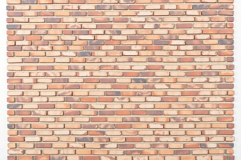
The masonry layout, drawing inspiration from the art of bricklaying, is a grid-like pattern that accommodates elements of varying heights. This layout style has gained immense popularity in web design due to its ability to create visually engaging and space-efficient arrangements of content.
The key advantages of masonry layouts include their efficient use of vertical space, visually appealing organization of diverse content, enhanced user engagement through dynamic presentation, and adaptability across various screen sizes and device types. These benefits make masonry layouts particularly suitable for image-heavy websites, portfolios, and content aggregators.
Implementing Basic Masonry with CSS Grid
At its core, a basic masonry layout can be achieved using CSS Grid. This approach provides a solid foundation for creating responsive and flexible layouts. Let's examine a fundamental implementation:
<div class="masonry-grid">
  <div class="masonry-item">Item 1</div>
  <div class="masonry-item">Item 2</div>
  <div class="masonry-item">Item 3</div>
  <!-- Additional items -->
</div>
.masonry-grid {
  display: grid;
  grid-template-columns: repeat(auto-fill, minmax(250px, 1fr));
  grid-gap: 15px;
}

.masonry-item {
  background-color: #f0f0f0;
  border-radius: 5px;
  padding: 20px;
}
This setup creates a responsive grid where items automatically adjust to fill available space and wrap to new rows as needed. However, it's important to note that this basic implementation doesn't achieve the true masonry effect of items filling vertical gaps seamlessly.
Advanced Masonry Techniques
To create more sophisticated masonry layouts, we can employ several advanced techniques:
CSS Grid with Auto-Placement
By leveraging CSS Grid's auto-placement capabilities, we can create a more authentic masonry layout:
.masonry-grid {
  display: grid;
  grid-template-columns: repeat(auto-fill, minmax(250px, 1fr));
  grid-auto-rows: 10px;
  grid-gap: 15px;
}

.masonry-item {
  grid-row-end: span 30;
}
This approach sets a small grid-auto-rows value and uses span to allow items to occupy multiple row tracks. The span value can be adjusted based on the content requirements, offering flexibility in item sizing.
Column-Based Masonry
For a column-oriented masonry layout, CSS columns provide an effective solution:
.masonry-grid {
  column-count: 4;
  column-gap: 15px;
}

.masonry-item {
  break-inside: avoid;
  margin-bottom: 15px;
}
This method creates a newspaper-like layout where content flows from top to bottom in columns, ideal for text-heavy layouts or when maintaining the original order of items is crucial.
Flexbox and JavaScript for Dynamic Masonry
Combining Flexbox with JavaScript offers greater control and flexibility in creating masonry layouts:
<div class="masonry-grid" id="masonryGrid">
  <!-- Masonry items -->
</div>
.masonry-grid {
  display: flex;
  flex-wrap: wrap;
  margin: -15px;
}

.masonry-column {
  flex: 1;
  padding: 0 15px;
}

.masonry-item {
  margin-bottom: 30px;
}
function createMasonryLayout() {
  const grid = document.getElementById('masonryGrid');
  const items = grid.children;
  const columns = [];

  // Create columns
  for (let i = 0; i < 4; i++) {
    const column = document.createElement('div');
    column.classList.add('masonry-column');
    columns.push(column);
    grid.appendChild(column);
  }

  // Distribute items among columns
  for (let i = 0; i < items.length; i++) {
    const columnIndex = i % columns.length;
    columns[columnIndex].appendChild(items[i]);
  }
}

window.addEventListener('load', createMasonryLayout);
window.addEventListener('resize', createMasonryLayout);
This approach offers precise control over item placement and allows for dynamic reorganization based on screen size changes, making it highly adaptable to various content types and responsive design requirements.
Enhancing Masonry Layouts
To truly master masonry layouts, it's essential to consider various enhancements that improve both aesthetics and functionality:
Responsive Design Considerations
Ensuring your masonry layout looks great on all devices is crucial. Implement responsive design techniques to adjust the layout based on screen size:
@media (max-width: 768px) {
  .masonry-grid {
    grid-template-columns: repeat(auto-fill, minmax(200px, 1fr));
  }
}

@media (max-width: 480px) {
  .masonry-grid {
    grid-template-columns: 1fr;
  }
}
These media queries adjust the column width and count for different screen sizes, ensuring optimal layout across devices.
Animations and Transitions
Enhance user experience with smooth animations that bring your masonry layout to life:
.masonry-item {
  transition: transform 0.3s ease-in-out;
}

.masonry-item:hover {
  transform: translateY(-5px);
}
These subtle animations add depth and interactivity to your layout, improving user engagement.
Implementing Lazy Loading
For performance optimization, especially with image-heavy layouts, implementing lazy loading is crucial:
document.addEventListener("DOMContentLoaded", function() {
  var lazyImages = [].slice.call(document.querySelectorAll("img.lazy"));

  if ("IntersectionObserver" in window) {
    let lazyImageObserver = new IntersectionObserver(function(entries, observer) {
      entries.forEach(function(entry) {
        if (entry.isIntersecting) {
          let lazyImage = entry.target;
          lazyImage.src = lazyImage.dataset.src;
          lazyImage.classList.remove("lazy");
          lazyImageObserver.unobserve(lazyImage);
        }
      });
    });

    lazyImages.forEach(function(lazyImage) {
      lazyImageObserver.observe(lazyImage);
    });
  }
});
This lazy loading implementation uses the Intersection Observer API to load images only when they enter the viewport, significantly improving initial page load times and overall performance.
Advanced Features and Optimizations
To take your masonry layouts to the next level, consider implementing these advanced features:
Infinite Scroll
Infinite scroll can greatly enhance user experience by dynamically loading content as the user scrolls:
window.addEventListener('scroll', () => {
  if (window.innerHeight + window.scrollY >= document.body.offsetHeight - 500) {
    loadMoreItems();
  }
});

function loadMoreItems() {
  // Fetch and append new items to the masonry grid
  // Implement API calls or database queries to retrieve additional content
}
This feature keeps users engaged by seamlessly presenting more content without the need for pagination.
Filtering and Sorting
Adding functionality to filter and sort masonry items enhances content discoverability:
function filterItems(category) {
  const items = document.querySelectorAll('.masonry-item');
  items.forEach(item => {
    if (item.dataset.category === category || category === 'all') {
      item.style.display = 'block';
    } else {
      item.style.display = 'none';
    }
  });
  createMasonryLayout(); // Reflow the layout
}
This function allows users to filter content based on categories, improving navigation and user experience.
Performance Optimization
To ensure smooth performance, especially with large numbers of items, consider these optimizations:
- Use the
will-changeproperty judiciously to hint at transformations - Implement virtual scrolling for extremely large datasets
- Optimize images by using appropriate formats (WebP, AVIF) and compression techniques
- Utilize CSS containment to isolate parts of the page tree, potentially improving rendering performance
Advanced CSS Techniques for Masonry Layouts
As we delve deeper into masonry layouts, it's worth exploring some cutting-edge CSS techniques that can further enhance our implementations:
CSS Subgrid for Nested Masonry Layouts
CSS Subgrid, a relatively new feature, allows nested grid items to align with their parent grid. This can be particularly useful for creating complex, nested masonry layouts:
.masonry-grid {
  display: grid;
  grid-template-columns: repeat(auto-fill, minmax(250px, 1fr));
  grid-gap: 15px;
}

.masonry-item {
  display: grid;
  grid-template-rows: subgrid;
}
While browser support for Subgrid is still growing, it offers exciting possibilities for creating more intricate and aligned masonry layouts.
CSS Houdini for Custom Masonry Layouts
CSS Houdini, a set of low-level APIs, allows developers to extend CSS by hooking into the styling and layout process of a browser's rendering engine. This can be leveraged to create custom masonry layout algorithms:
if ('layoutWorklet' in CSS) {
  CSS.layoutWorklet.addModule('masonry-worklet.js').then(() => {
    console.log('Masonry worklet registered');
  });
}
// masonry-worklet.js
registerLayout('masonry', class {
  static get inputProperties() {
    return ['--column-width', '--gap'];
  }

  async intrinsicSizes() { /* ... */ }

  async layout(children, edges, constraints, styleMap) {
    // Custom masonry layout logic
  }
});
While CSS Houdini is still an emerging technology, it holds great promise for creating highly customized and efficient masonry layouts.
Accessibility Considerations for Masonry Layouts
When implementing masonry layouts, it's crucial to consider accessibility to ensure all users can navigate and understand the content effectively:
- Use proper heading structures within masonry items to maintain a logical document outline
- Ensure keyboard navigation is possible between masonry items
- Provide alternative text for images and meaningful labels for interactive elements
- Consider the reading order of items, especially when using JavaScript to reorder content
<div class="masonry-grid" role="grid">
  <div class="masonry-item" role="gridcell">
    <h2>Item Title</h2>
    <img src="item-image.jpg" alt="Description of image">
    <p>Item content...</p>
  </div>
  <!-- More items -->
</div>
By incorporating these accessibility features, you ensure that your masonry layout is usable by a wide range of users, including those using assistive technologies.
Future-Proofing Your Masonry Layouts
As web technologies continue to evolve, it's important to stay informed about upcoming features that could impact masonry layout implementations:
- Keep an eye on the development of CSS Grid Level 3, which may introduce native masonry functionality
- Explore emerging layout models like CSS Flexbox Gap and the potential for improved alignment features
- Stay updated on browser support for advanced CSS features and adjust your implementations accordingly
Conclusion
Masonry layouts offer a powerful way to present diverse content in an engaging and efficient manner. By leveraging CSS Grid, Flexbox, and strategic JavaScript, along with advanced techniques and optimizations, you can create stunning, responsive masonry layouts that enhance user experience and showcase your content beautifully.
Remember, the key to mastering masonry layouts lies in understanding the underlying principles and experimenting with different techniques. As you apply these concepts to your projects, you'll develop an intuitive sense for creating layouts that are both visually appealing and functionally robust.
The world of web development is constantly evolving, and staying ahead of the curve with techniques like masonry layouts will set you apart as a skilled and innovative developer. Continue to explore, experiment, and push the boundaries of what's possible with CSS and JavaScript. Your journey in web development is an ongoing process of learning and refinement, and mastering advanced layout techniques like masonry will undoubtedly contribute to your growth and success in the field.